NexoPrima Patient Monitor
Project Duration
October 2018 - December 2018
Team
1 x Product Managers
1 x UI/UX Designer
Company
NexoPrima

My Role
I was tasked to design the UI and develop the front end codebase for this project.
Background
Nexoprima is a newly founded startup specializing in Medical-Tech Appliances, including Patient Monitors, Bedside Ventilators, and Nitric Oxide Delivery Devices. Recently, they have secured a research grant from a well-known private hospital in Malaysia to lead an initiative for an integrated electronic medical record system.
The goal is to centralize data obtained from every purchased proprietary medical appliance from various brands such as General Electric, MindRay, and Philips. This data will then be accessible to registered users worldwide via any device capable of running a modern internet browser, such as Chrome.
One prominent use case for this project is during a heart surgery in an Operating Theater. Healthcare practitioners can watch and monitor the patient's progress from elsewhere, regardless of their location.
Ideation & Process
Medical Appliances UI Convention
Patient statistics are complex and come in various forms of numerical data. Given the short duration of this project, I do not have the opportunity to conduct the usual UX exercises that I typically perform with other projects.
Following the common rule of thumb when dealing with well-established consumer products, I experimented with my design exploration using the conventional UI standards for Medical Appliances.
Graphs, Vibrant Colors, and Mobile Friendly
One of the critical features that sets this initiative apart from existing solutions is the ability for users to scan a QR code from a device and view it on their mobile phone. Consequently, the challenge lies in adapting the entire interface to a smaller format.
I was struggling to find the best graphing approach for this project. Since it runs on a web browser, I needed to be cautious about its performance when more than three graphs are running concurrently.
Additionally, the color scheme chosen is within the dark spectrum, which is friendly to human eyes in dimmed room settings. The device is typically switched on 24/7 next to the patient. Having a bright background would be a poor choice since it would illuminate the entire room at night (during sleeping hours).
Visual Design
Inspiration from Established Brands
I drew inspiration from established brands such as Philips, Mindray, and General Electric. These companies have been in the medical appliance industry for decades, and their products are widely used in hospitals worldwide.
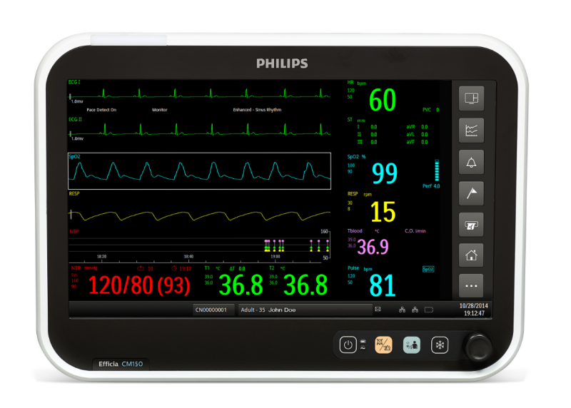
Philips CM150 Efficia Interface

General Electric Patient Monitors
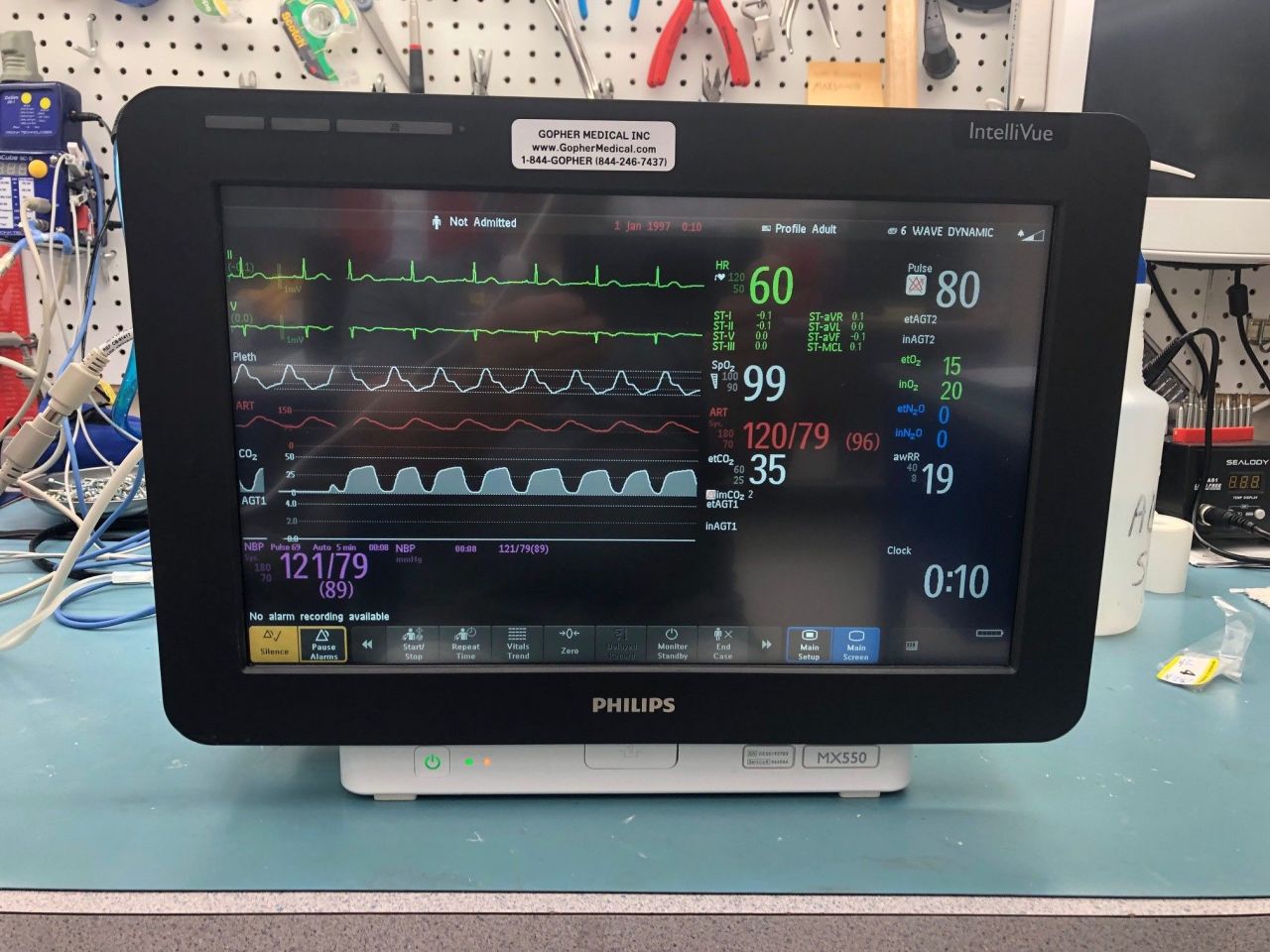
Philips MX550 IntelliVue Interface
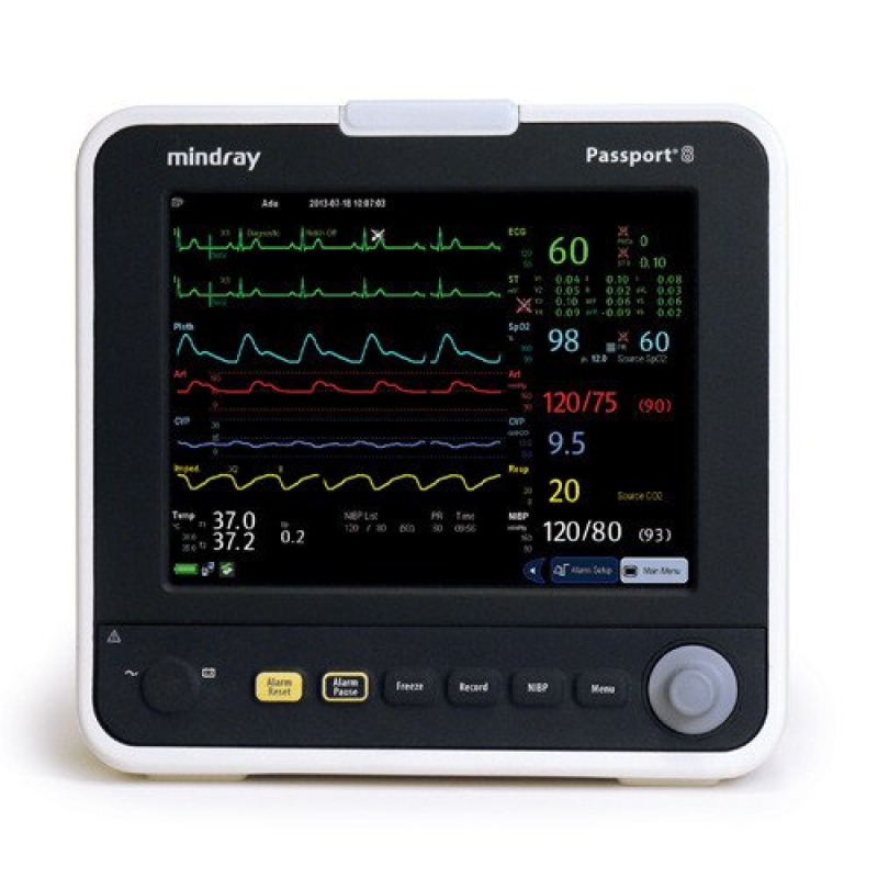
MindRay Passport8 Interface
HiFi Design Exploration
After several iterations and feedback sessions, I finalized the design and proceeded to develop the front-end codebase using HTML, CSS, and JavaScript. The result is a responsive, mobile-friendly, and performant interface that meets the project's requirements.
As with my other projects, I have also prepared a thorough how-to guide on how to run this project locally and paramount CSS classes usage, in case they want to develop the code base further.
You may experience the functionality firsthand by exploring the DEMO version, which operates seamlessly across various browsers. For a comprehensive demonstration, visit the Web version, optimized for standard browsing. Additionally, try Mobile Optimized version for an enhanced experience on handheld devices. To delve deeper into the frontend aspects, you can have a look at the Frontend Documentation.
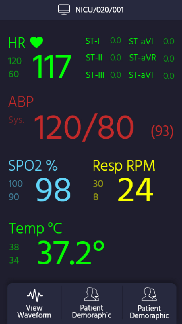
Mobile View - Vital Sign
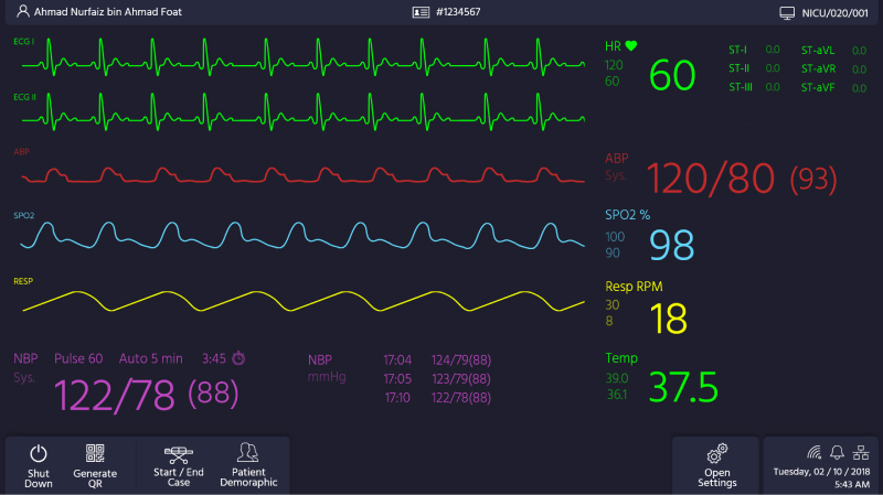
First HiFi Mockup - Landing Screen
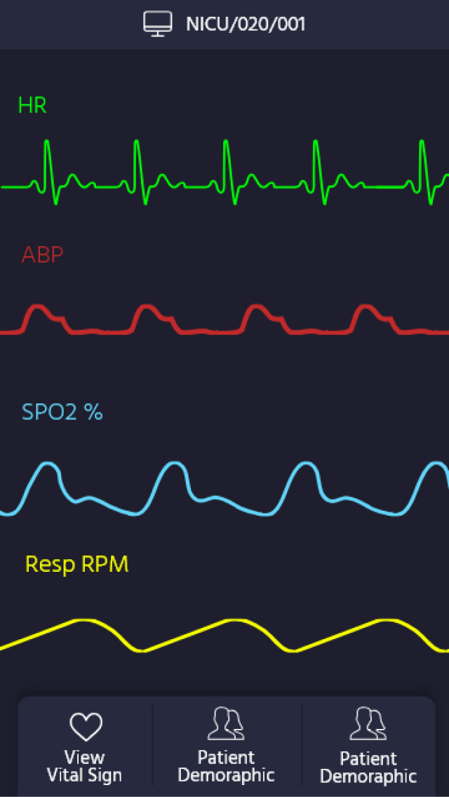
Mobile View - Viral Graph

Device Setting Page

On Screen Keyboard for Touch Screen Use Case

Device Connectivity Stats
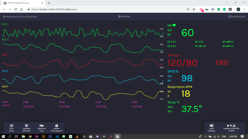
Final Product - Tested on Chrome
Previous
Next