Maxis Ookyo
Project Duration
March 2017 - April 2018
Team
1 x Product Managers
1 x Web Developers
1 x Android Developer
1 x UI/UX Designer
Company
Maxis
My Role
As the sole UI/UX person in this project, I was tasked to drive the full design initiative for its early concept, wireframes, mockup, and final deliverables. The UX team for BAU (Business as Usual) provided insights on Maxis’ legacy product toolchain and ultimately helped me to complete this project.
Background
Maxis was founded in 1993, and it is a leading telco company in Malaysia. It has two mainstream brands that they market for the masses namely Maxis Hotlink and Maxis Postpaid. When I joined Maxis, they were setting up an internal incubator to develop a new product and set it apart from another offering to the existing customer — sort of like a skunkworks inside a big corporate firm.
It was a team of five core people including me, six outsourced developers, 3 PMs from Accenture and two digital brand agencies. The objective was to develop a full mobile experience telco within a year with the CAPEX of MYR2,000,000. It was an experiment by Maxis to make use of the latest cloud services by AWS and some other provider in the market. The project is called Ookyo.
Ookyo is a new sub-brand under Maxis, and it taps into the same network that’s used by Maxis and Hotlink. It is a digital-only platform where everything from purchasing a new SIM to customer service is done online. Its customer service operates 24/7 and serves by a built-in chatbot.
I was told that one of the paramount features for Ookyo is to be able to entice youth (Digital Native) just by looking at it.
Ideation & Process
Competitive Study
When I received this task, the first thing that I did was to research as much information as possible about any full digital initiative from all leading telcos in the world. Since this was my first time working for a telco product, I was looking for a UX pattern that perhaps could be a hint to kickstart this project.
Hurdles in Concept Design Exploration
Few needed core requirements to design this product was not available until we were three months to the launch date. The common practice of large corporation that loves to outsource these key elements was a bit prohibitive in some sense. It was tough for me to design even the whole concept of the app.
Some of the core requirements were the brand guidelines, an epic flow chart of how the system will work and the built-in chatbot architecture. Almost all of its major backend logics were handled by a third party vendor.
In order to tackle this while not lagging the timeline. I decided to play around with a few concepts that mostly ended up in the final product later. This concept helped the PM and other stakeholders in this project to get an overview of the end-product. It also helps to validate the business requirement needed, and we regularly use this to tweak it further and run some tests.
Visual Design
Earliest HiFi Mockup
Since the project was already underway when I joined, there was no time to waste. Instead of sketching wireframes, I immediately began working on high-fidelity mockups and conducted initial user testing to validate hypotheses about core features, such as the in-app wallet, multi-package selection, and new member registration.

Splash Screen

Login Screen

Package Selection

Porting Number Screen

Checkout Screen

Input Form
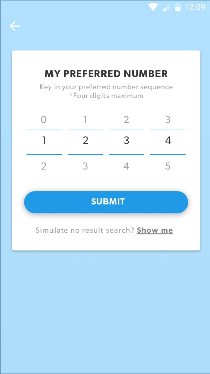
Number Picker

Radio Selection
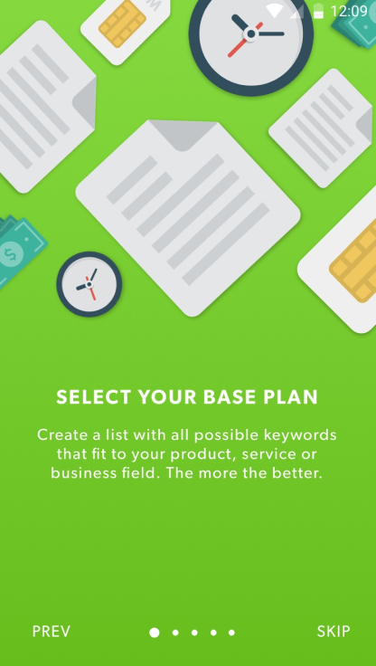
Splash Screen Copy A
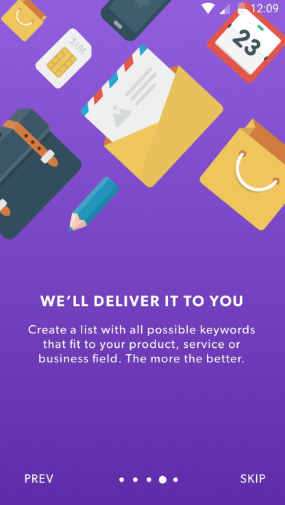
Splash Screen Copy B
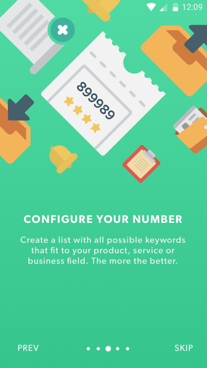
Splash Screen Copy C
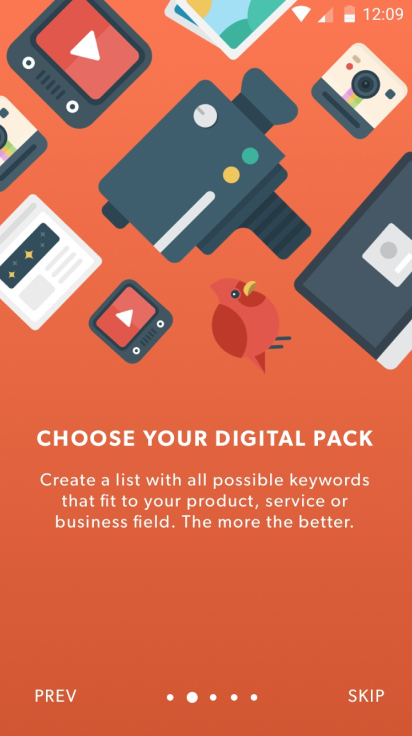
Splash Screen Copy D
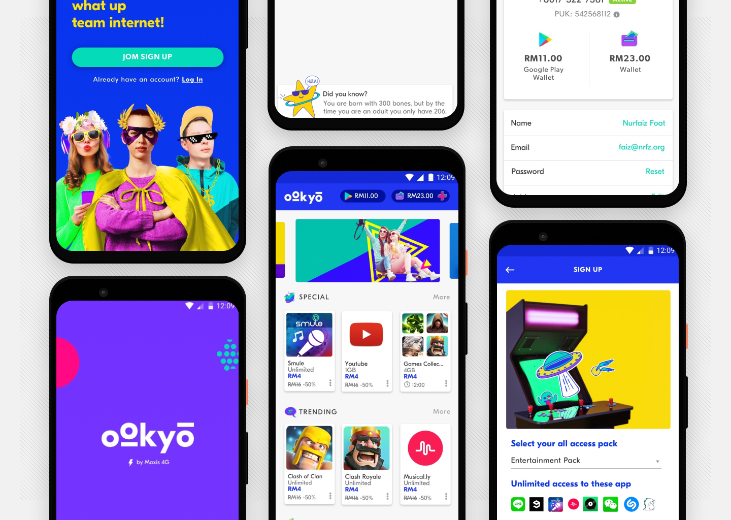
The Final Look and Feel
The Ookyo brand guidelines mandate a vibrant, colorful, and chic aesthetic, reminiscent of Snapchat, or perhaps even neo-brutalism. Once the comprehensive branding CI was finalized, my original app concept, which had previously undergone testing, seamlessly integrated with it.
In addition to designing all the requisite UI and screens, I also contributed to the development by coding some of the pages for the web version using HTML, JS, and CSS. This effort freed up the team from having to deal with the stylesheet and layout intricacies, providing them with a robust scaffold for further development.
We successfully launched the app in September 2017, garnering significant attention and positive buzz within the local tech community for its funky-chic and original design. It was one of my proudest moment as a designer.
Press Mentions
Ookyo has garnered positive press coverage, earning accolades for its innovative approach and customer-centric services.
Soya Cincau - https://goo.gl/TqAF3e
Amanz - https://goo.gl/PGaXU8
KL Gadgetguy - https://goo.gl/kkoCVR
Technave - https://goo.gl/PWf8hL
Lowyat - https://goo.gl/oH5a3Q
More Screenshots

Landing Screen
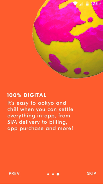
Onboarding
Splash Screen
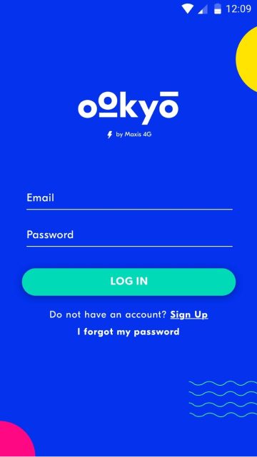
Log In Page

Credit Topup

Empty Negative State
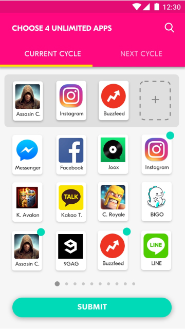
Unlimited App Selection
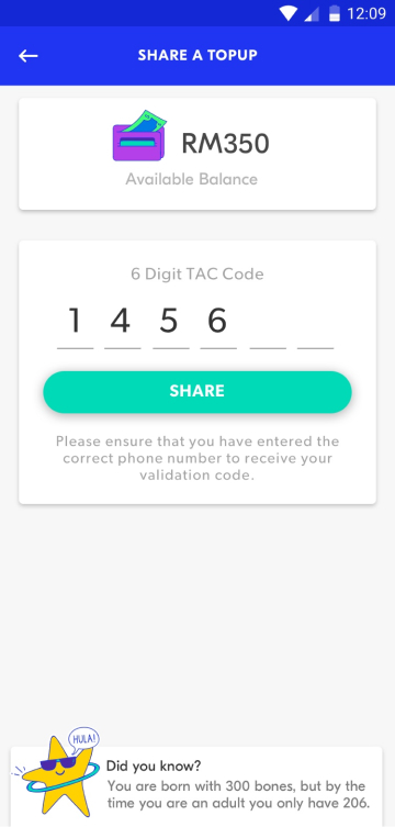
TAC Request

Home Listings

Sign Up Page
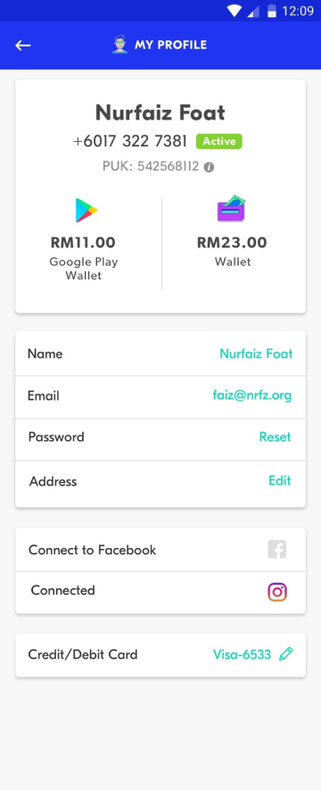
My Profile

Sidebar Menu

A photo of our final product in the hand of user. Image from SoyaCincau

The main landing page (web)
Previous
Next