Supahands Workplace
Project Duration
March 2016 - May 2017
Team
1 x Product Managers
4 x Web Developers
2 x UI/UX Designer
Company
Supahands

My Role
At this time around, the design team has grown slightly larger than the previous year. I was tasked to spearhead the design effort for the end to end experience of a new Supahands’ product - codename Babycino (which later renamed as Supahands Workplace, and finally known as DIANE)
Background
Supahands Workplace is a proprietary enterprise management platform that manages SupaAgents (remote freelancers) and delegates the work evenly to them based on different timezones, skillset, and availability.
Because of the many amounts of projects that Supahands were getting, SupaAgent does not necessarily work on one project at a time; instead, they have to work on multiple assigned projects to meet the deadline.
Prior Workplace, all of these were managed manually in Google Spreadsheet among Project Managers. The time it took to delegate the task itself already amounted to a few days per project. The manual delegation hours were considered as an absorbed cost and were not taken into account when we charge our client.
Optimizing this process is no brainer and will enable Supahands to increase its yearly revenue. The idea was to automate as much as possible the task of assigning the project to SupaAgents.
Ideation & Process
In House Interview with the PMs
Even though we have worked together in a close-knit environment since the early days of the company, there are more uncovered pain points that have not been discussed thoroughly. This includes new use case challenges that surfaced when Supahands received more workload and serving multiple clients at once.
Here come the hurdles in so many axes.
1) SupaAgent has to be available, skillset fit and in permissible timezone to work on a particular project.
2) Project Manager will set the constraint for a project based on the requirement of skillset, deadline, and budget.
3) SupaAgent on their dashboard has to select their availability, certified skillset and their willingness to work on any chosen project.
4) The client can monitor the progress from the dashboard.
So what we did to understand was to sit down with the Project Manager periodically for almost six months and learn their manual processes. Next, we proposed plenty of solution prototype and iterated it many many times. My primary role in this exercise was to conceptualize the epic user flow, draw the wireframe for testing, help PMs run the user testing with the real subjects and deliver the final UIs to the developer once we are all OK with the solution.
We didn't get to solve everything at once after that long exercise, but we squashed major hurdles and sped up the delegation process by 75%.
We developed a shared timeline schedule that acts as a calendar and also a booking chit that is accessible to both Project Managers and SupaAgent before the project is in active mode.
Epic User Flow
Before I carry out any design work, I took all the gathered information from the interview and itemized them in the form of epic user flow. Its printed version is then blue-tacked onto the wall to gather feedback for another week.
We placed this epic user flow at the office lounge so that all stakeholder in this project can contribute without any prohibitive feeling. After a week, we released the revised version of it and presented it in the progress meeting.
User Dashboard
Supahands Workplace dashboard is a new product that we have decided to build from the ground up. Meaning to say, we were going to retire the old codebase and replace it with a new one.
Around this time also, Supahands business vertical has shifted entirely to serve the B2B market. Hence the dashboard has to reflect a more detailed experience compared to our B2C segment last time

A snippet of the epic userflow. You may download the whole view in PDF format at Supaflow

PM Profile Page

PM Listing Page
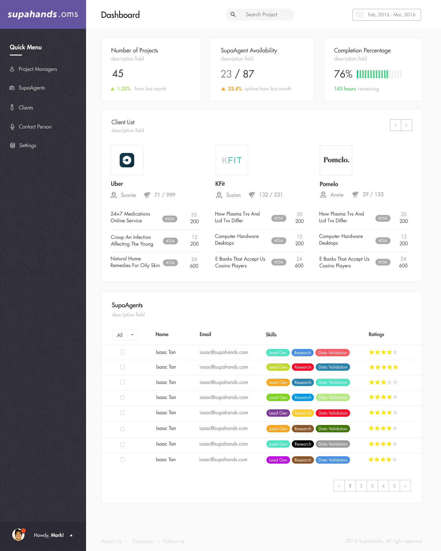
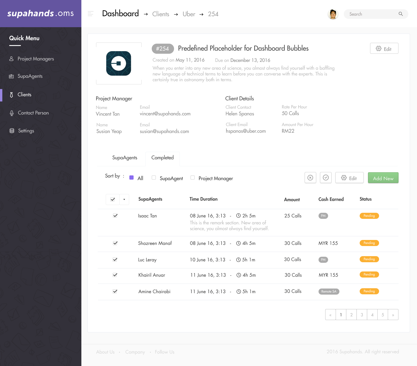
Screenshots of the main view of the dashboard. Access the static page here - Supahands OMS Demo
Visual Design
Design for Business
There is a need to emphasize details in B2B UX design. We found out from our feedback process; our business client requires much more information about any project that they assigned to us. Some of the examples are; starting and completion date, man-hour committed, a live status of the work and the total amount of cost that they need to pay.
It took multiple rounds of testing and feedback gathering for all of these details. The result was a clean and visually driven dashboard that portrays only the crucial information needed.

Some note taking on the need and wants from the PMs
Workplace Design Guidelines
I was thinking this new product should have an established visual consistency because with the different designers going to have work on this project in the future, we can’t afford any less-thought feature deviation. So, I created a brand style guide and published it on the share cloud document in the team.
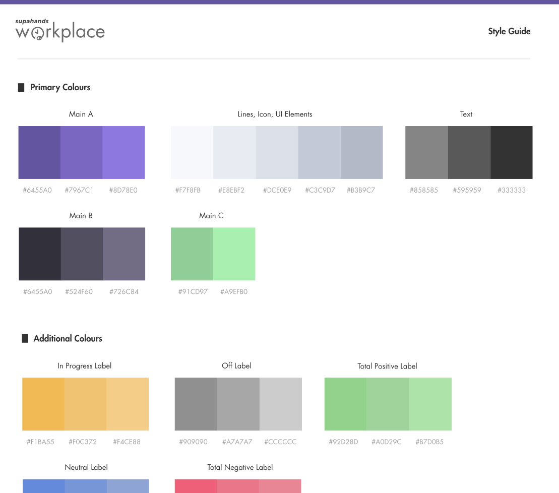
You may have a look at the PDF version of this here - Supahands OMS Design Guidelines
Delivery and Handoff
For Supahands Workplace, I help coded the early version of it so that the developers can scaffold on it later on. Apart from that, I also prepared the needed assets as usual and categorized it correctly using the agreed naming convention.
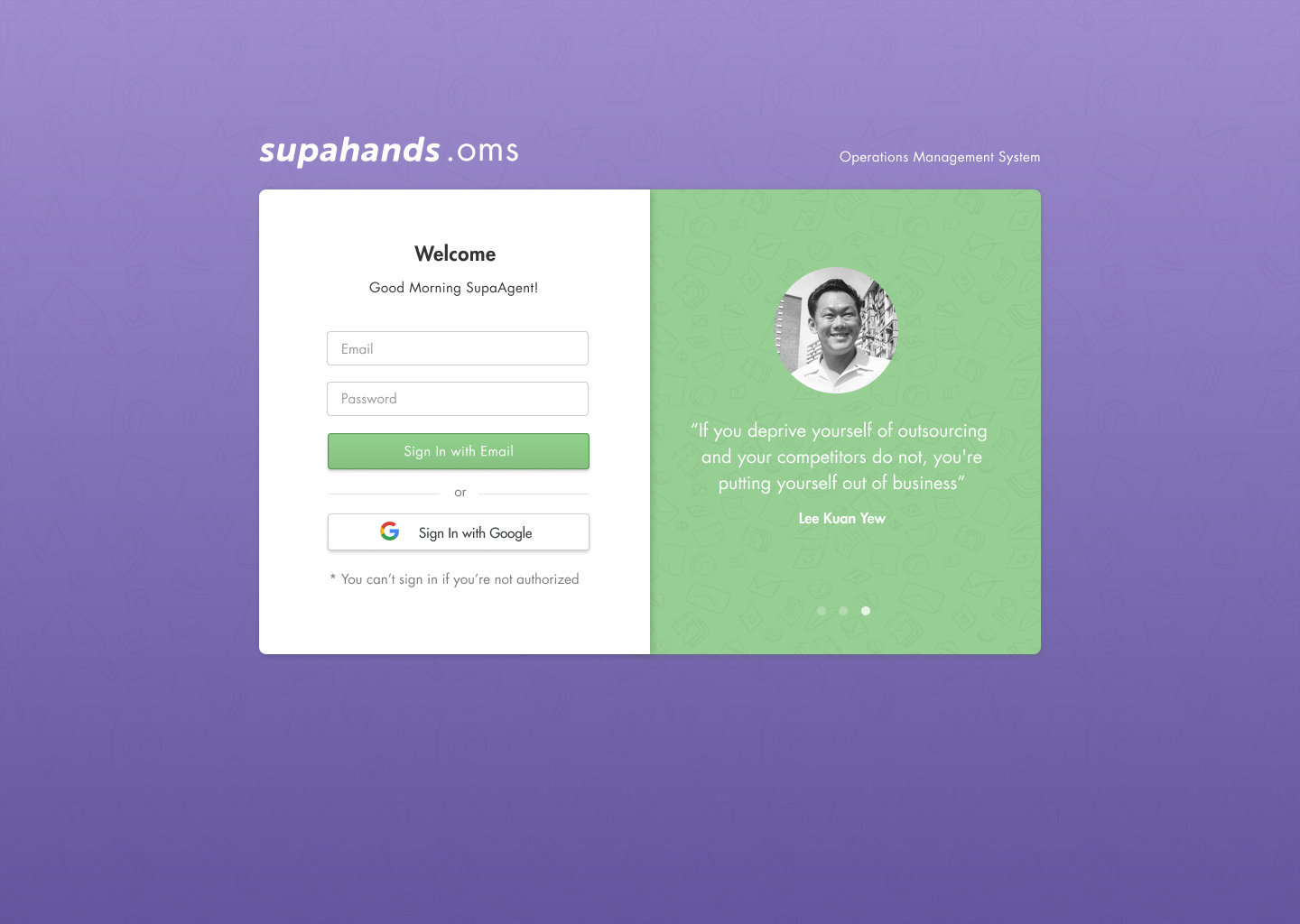
Sign in Page
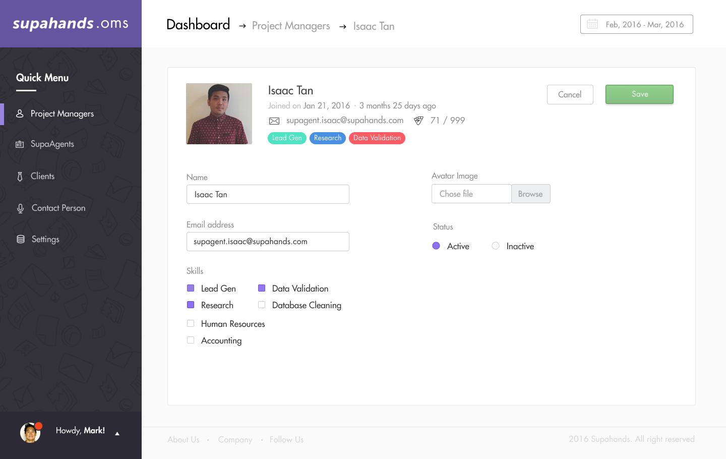
PM Profile Page - Input

Client Page A
Client Page B

SupaAgent Page

Clients Listing Page
Previous
Next