Supahands Redesign
Project Duration
May 2015 - May 2016
Team
1 x Product Manager
1 x Frontend Developer
1 x Product Designer
Company
Supahands
My Role
Supahands was just a year old when I was brought in as their new UI/UX guy. As a new company, it pivoted a few times to suit the market needs. My task this time around was to design a unique experience for its landing pages and web app (dashboard) to reflect the latest branding and business direction.
Background
When Supahands was first founded, it was a platform for freelancers to sign up and become virtual assistants for all types of tasks such as flight ticket booking, event planning, meal ordering, data entry, and transcribing.
These freelancers are called SupaAgents. Our SupaAgents mainly comprise college students, homemakers, single parents, and retirees based in the South East Asia region (Malaysia, Indonesia, Singapore, and the Philippines). We charged our clients by "Hands." A "Hand" equals 20 minutes' worth of work. The rate, however, ranges from MYR8 - MYR12 (USD$1.96 - USD$2.94) per hand according to the complexity of the work.
The whole web app of Supahands was originally designed by a digital agency, commissioned by the founders. It already worked great; however, as the business demand grew, its MVP version of the landing page and its web app became outdated. So there was a need to address that quickly.
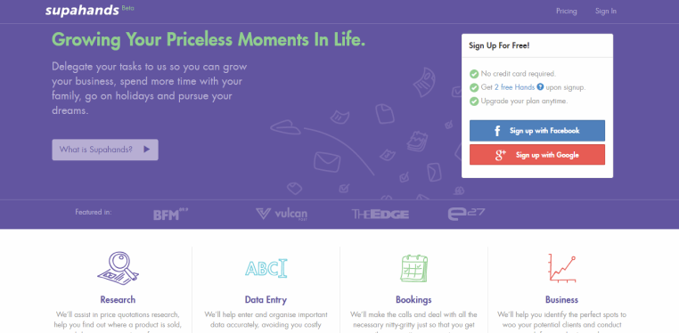
Screencap of Supahands Over the Fold view in 2014
Ideation & Process
Comparative Analysis Old & New
Almost 50% of the landing page content was similar. So I need to make a brief comparison between the old and the new. It looks natural on the surface, but to be frank, I need to relearn what the previous designer developed few years back.
Apart from that, the core team organized many meetings with the stakeholders to obtain as much information as we could and tabulate it as a needed item in the new version.
Site Map & Userflow
Apart from eyeballing on what could be the changes needed. I redraw the site map of the first version to help me look more in-depth on the real journey. Since Supahands only have one developer at that time, we decided on a consensus to not elaborate further on the UX flow from the first version landing page since it is going to require more time to develop the system.
This site map then serves as a reference point every time the team has to do a discussion about the site

Screencap of Public Facing Site Map
User Dashboard
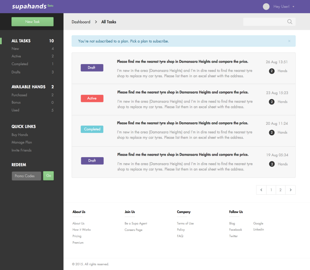
As for the user dashboard, it was a different story altogether. We overhaul the first version into a better one. The user feedback that we gathered helps us to solve certain pain points that matter.
We’ve introduced color coding for our task status’ which makes it all easier to vet through many existing tasks in a glance. Other than that we’ve also decided to make it a little clearer on how many Hands each task has taken. So now it’ll always be clear how many Hands each of the tasks has taken, helping the user keep track of it all.
Lastly, we try to emulate what others did in term of information sorting so that the user has more control over how they will see their dashboard. All controls now are positioned to the left side menu.
The method before this was to use a dropdown list to filter through tasks based on its status. We’ve done away with that and have placed these filters on the left sidebar as well.
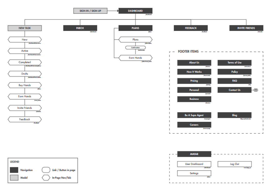
Screencap of Registered User Site Map
Visual Design
Centralise Information
A hired digital agency developed Supahands branding on its early day. Fast forward, during this redesign process, I took the chance to document it into a version where it is publicly accessible and neatly informed.
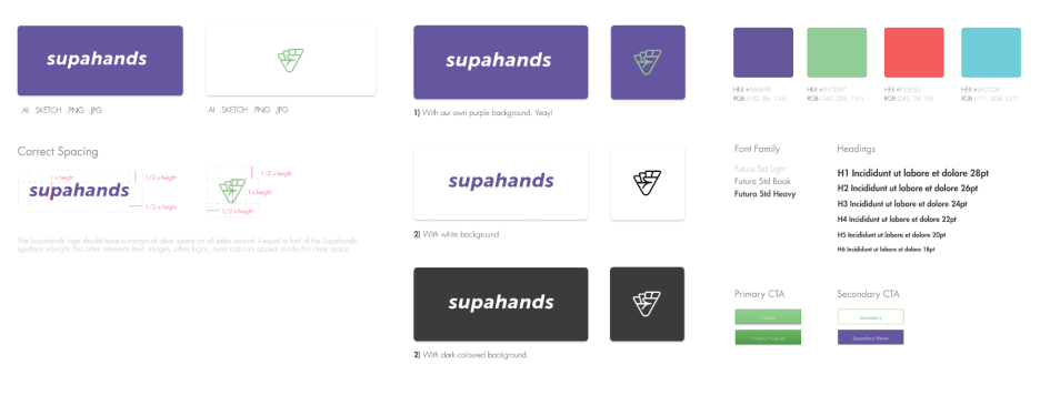
Branding Guidebook Screencap
The SupaCharacters
Honestly, I’m no illustrator, but my other colleague that was also a UX Designer in the team help us to grow the character further to accommodate the new design. It was a tough one I must say. Using a visual character aspect in your web design somehow very limitive in term of what you can do with your overall design language. However, we managed to get hold of it eventually by settling on a middle ground.
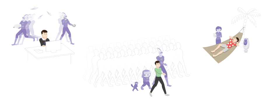
SupaCharacters help to visualise product intention.
Delivery & Handoff
The product development team at that time was no bigger than five people including me. When all was said and done, I help coded some of the front end pages which I implemented using Bootstrap and Javascript. Most of it managed to get released in production.
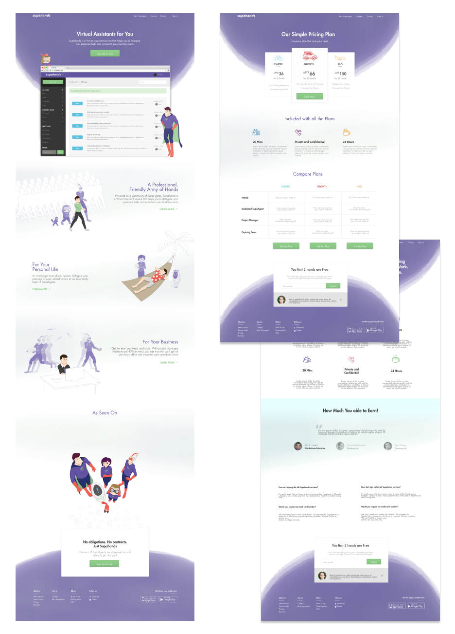
The final landing page screens
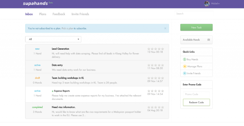
The old dashboard.

The final and deployed dashboard.
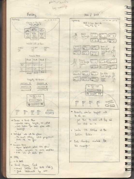
Quick wireframing before jumping into the hi-fi mockup.
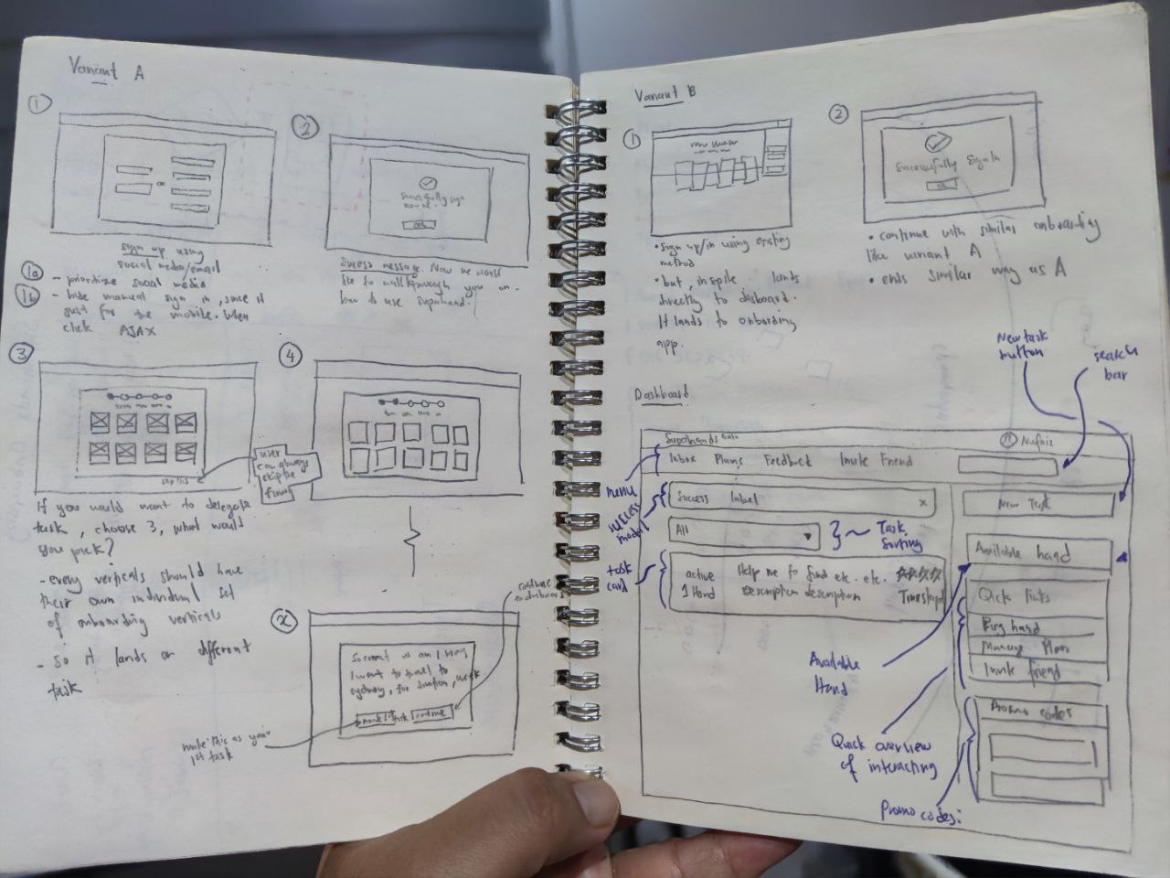
Doodling on the notebook is the fastest way to get an idea across.
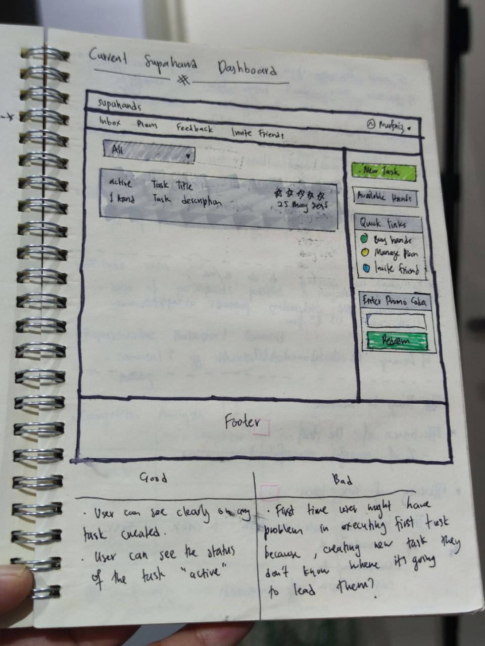
Playing with the idea of how to present the information.
Previous
Next