Lelong.my Mobile App
Project Duration
May 2014 - May 2015
Team
1 x Product Manager
1 x iOS Developer
1 x Android Developer
1 x UI/UX Designer
Company
Lelong.my
My Role
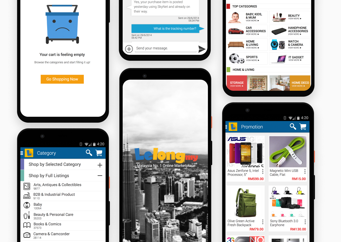
As the sole UI/UX person in the company at that time, I was tasked to drive the redesign initiative of existing Lelong.my app. I primarily focused on making the browse flows and the purchase flow seamless and intuitive for the existing user base as well as new users.
Background
An earlier version of the Lelong.my apps were developed hastily without taking any UX consideration due to the FOMO trend with other local e-commerce players. Both apps on iOS and Android platforms looked and behaved differently, as independent teams developed them with varying timelines.
The company decided to revamp the apps to provide a better user experience and to increase the conversion rate. The apps were redesigned to be more user-friendly and to have a consistent look and feel across both platforms.
The team main charter was to come out and develop a single experience that works across the platform with consistent icon sets, typography, UI patterns, and brand language.
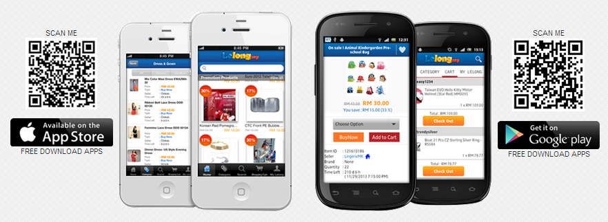
Early version of the app. Released on 2013
Ideation & Process
Impulse Buying Home Page
In the previous versions of the app, the user is welcome by a landing page that is filled with a single promo of the day poster and that's about it. Inspired by Alibaba’s TMall and Taobao, I designed a further developed home page by showcasing interesting curated products for that week.
This home page helps new users to glimpse through what are the latest deals in every category in a glance. It also generates new impulse buying feeling to all users will then counted as a conversion.
Seamless Browsing
We try to develop a shopping experience that both satisfy the old and new users. Initially, as we gathered more info on how our user use the app, we have found that old/seasoned user will start looking at their desired product by using the search bar filter function.
In order to facilitate that experience, I went for a full blown category listing that is alphabetically arranged accessible from the sidebar. Under this listing also, I gathered top categories that user tend to purchase from such as Fashion, Home & Living, 3C (computer, communication, and consumer electronics) and place them under the selected category.
Wireframing on paper help to play an integral part in the iteration process. Later on, I transferred all this lo-fi mockup into Sketch and then InvisionApp to share the flows with the team and other stakeholders.
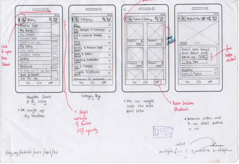
Wireframe to ideate on the new home page
Private Message with Merchant
Although the web version of Lelong.my platform allows the user to message merchant directly. The app, unfortunately, does not. We really want the conversation to be short and concise, and it should be about the product offered by the merchant.
The main hurdle with this feature was to determine which is the best entry point for the user to initiate the conversation; Is it at the Store Page or at the Product Page.
Since we did not want to limit this function, we decided to place it at both points. However, the logic will automatically feature the latest item purchased from the seller by the user at the top of the conversation bubble.
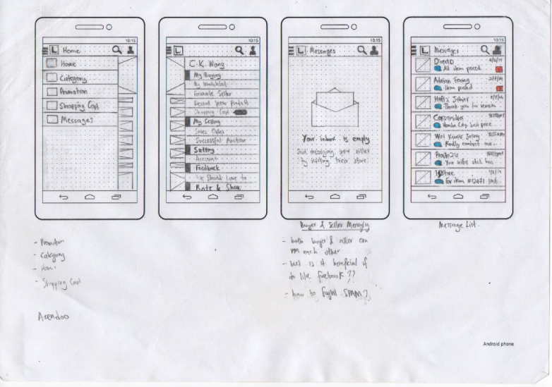
Wireframe to ideate on the new messaging feature
Visual Design

Splash Screen

Login Screen
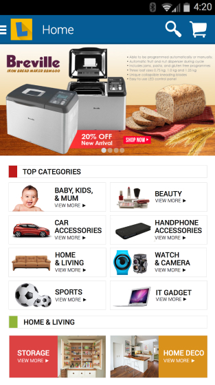
Front Page
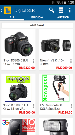
Product Listing
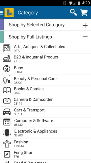
Sidebar Categories
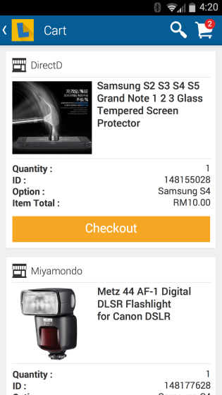
Your Shopping Cart
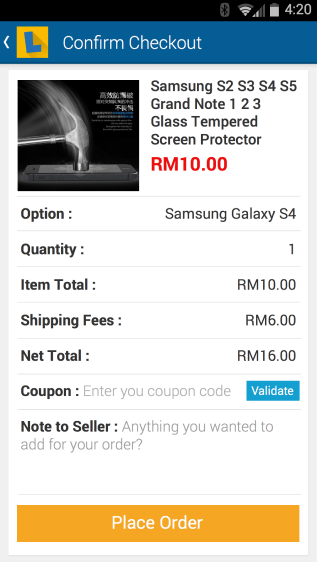
Order Checkout
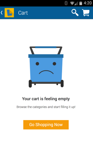
Cart Empty State
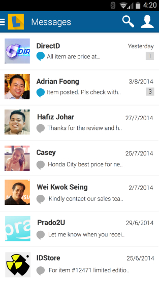
Messaging Function
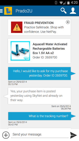
Customer to Seller Conversation
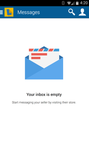
Inbox Empty State
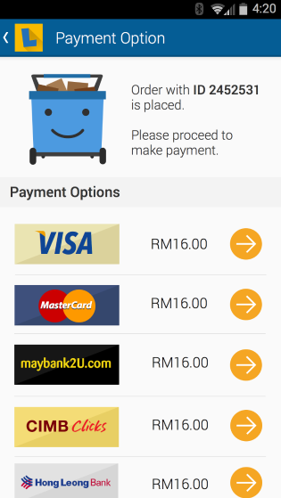
Payment Option
Restrospective
This project helps me to embark my journey into Product Design full time. I learned heaps of new UX fundamentals and also some critical skills in dealing with developers and project managers. I also picked up reading more seriously especially in the product design topics.
Honestly, this project does not look that good and polished when we release its new design later that year. However, we did receive positive feedback from our users stating that the latest experience was far seamless than before.
My proudest moment was when Lelong.my app was ranked top 3 in the Google Play Store at that time in the category of online shopping.
Previous
Next